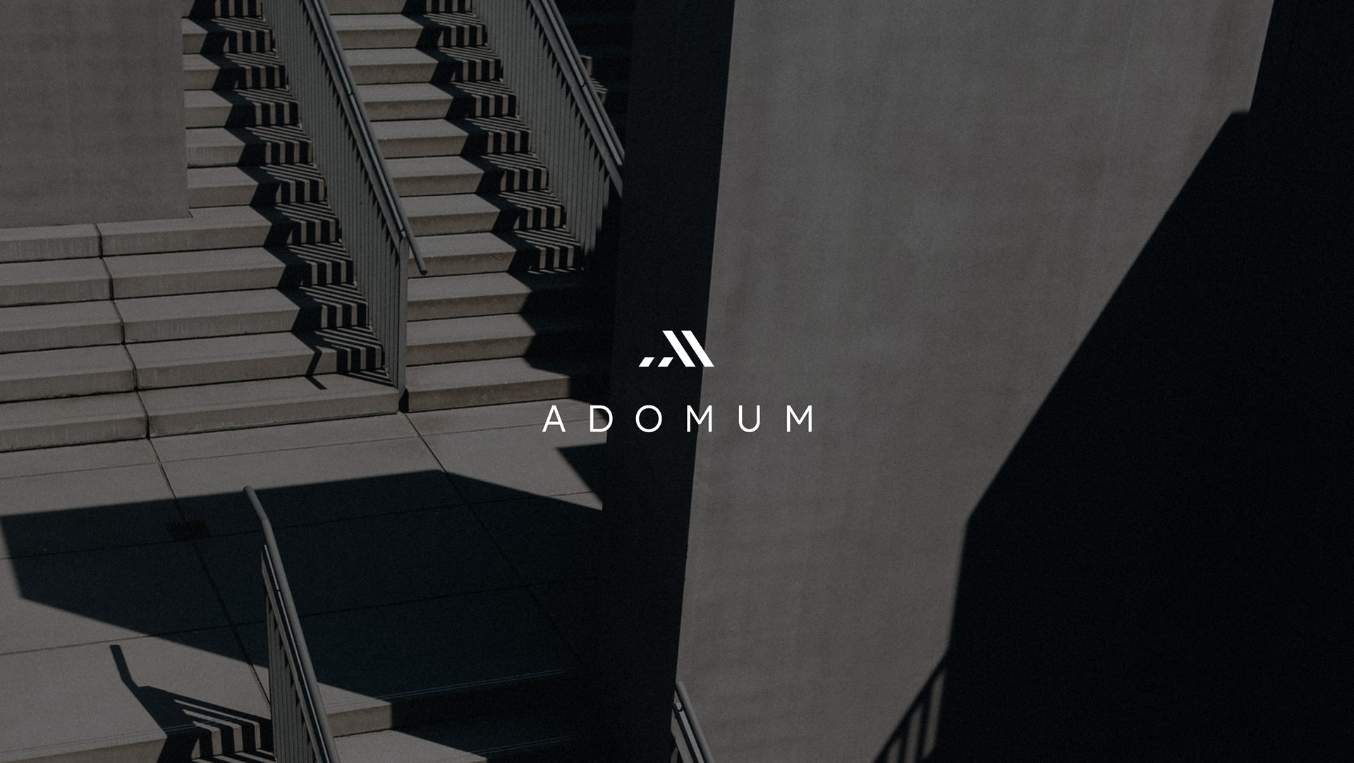
ADOMUM GmbH
Adomum GmbH is a real estate company with headquarters in Berlin. The company has been operating on the market since 1983, trading, renovating and developing high-quality real estate projects.
Task
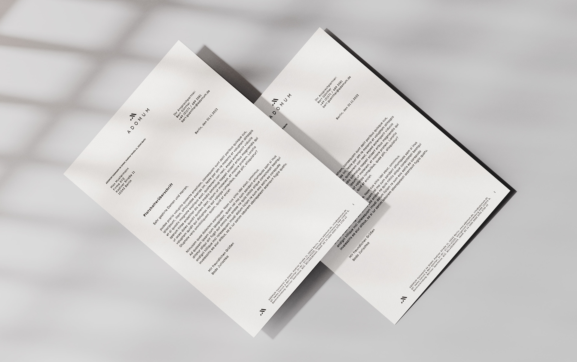
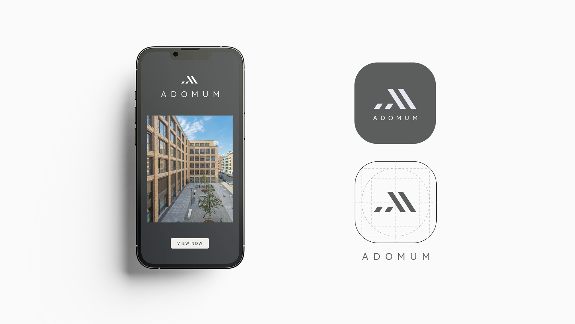
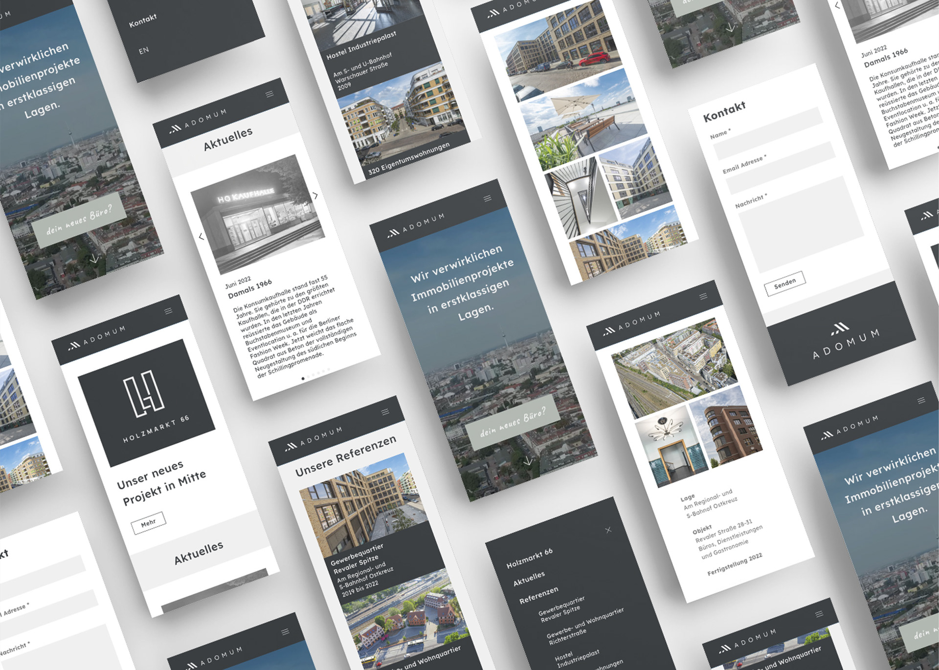
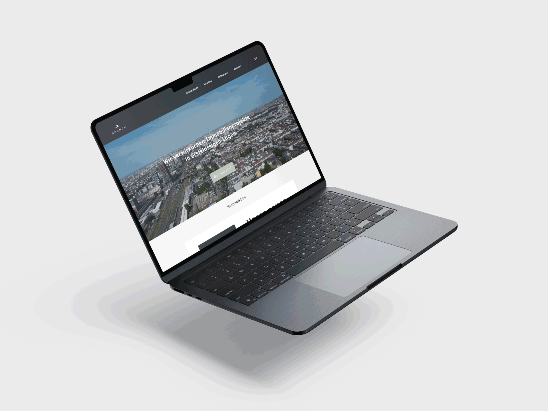
The assignment was to design a matching logo with visual identity, business stationery and new website to go with the company‘s new name "ADOMUM". The company should present a high-quality image, with many years of experience, down-to-earth and sustainable.
Inspiration
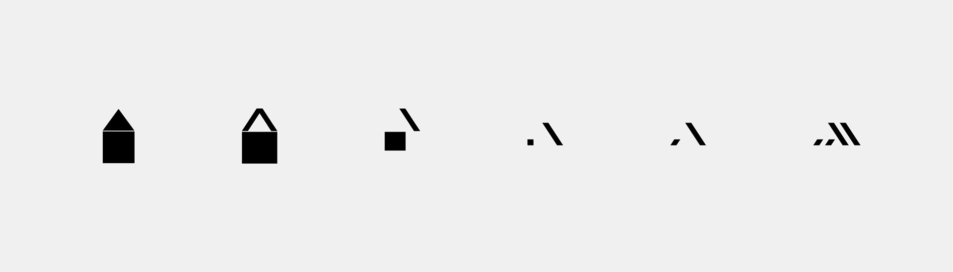
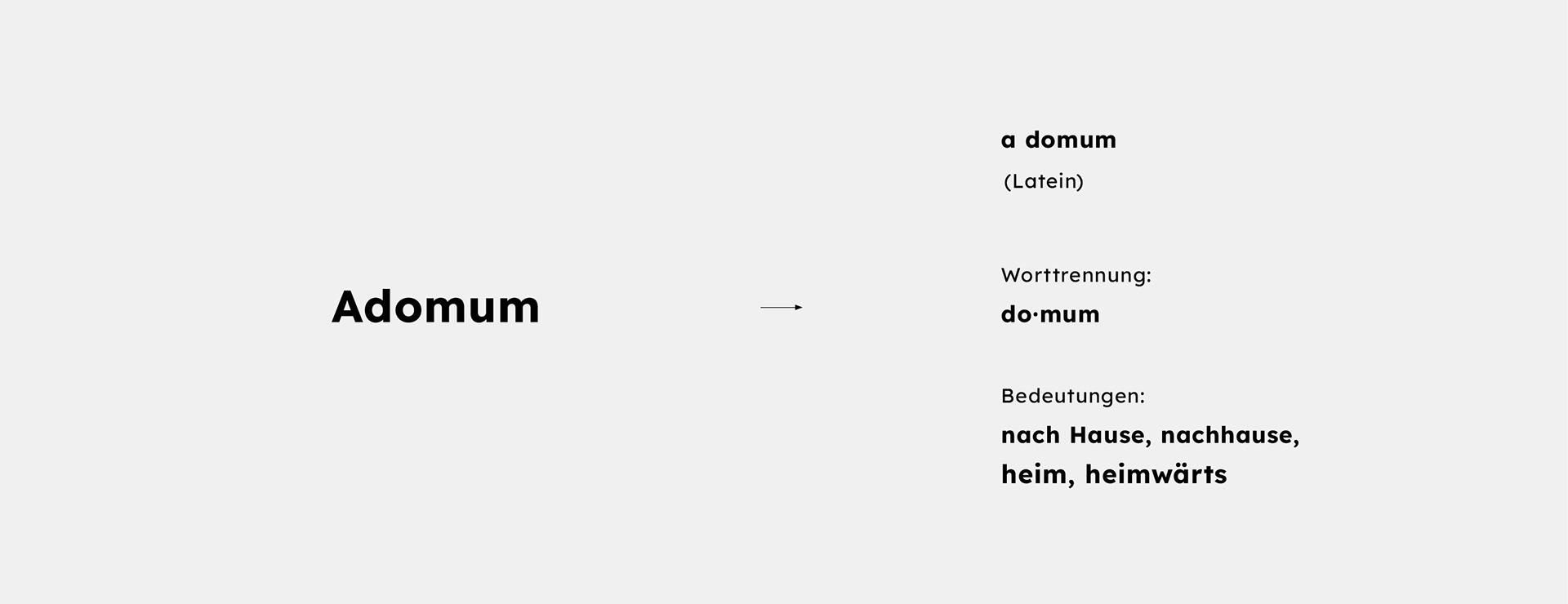
The logo is formed from terms inspired by the Latin name ADOMUM (house, home). Two basic elements of a house - the foundation stone and the roof - serve as symbols. This construct twice - representing two managers or multiple projects. Also the letter A - is visible at first view.
Concept
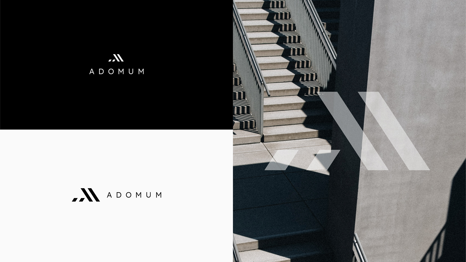
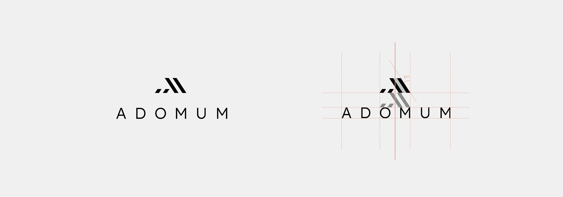
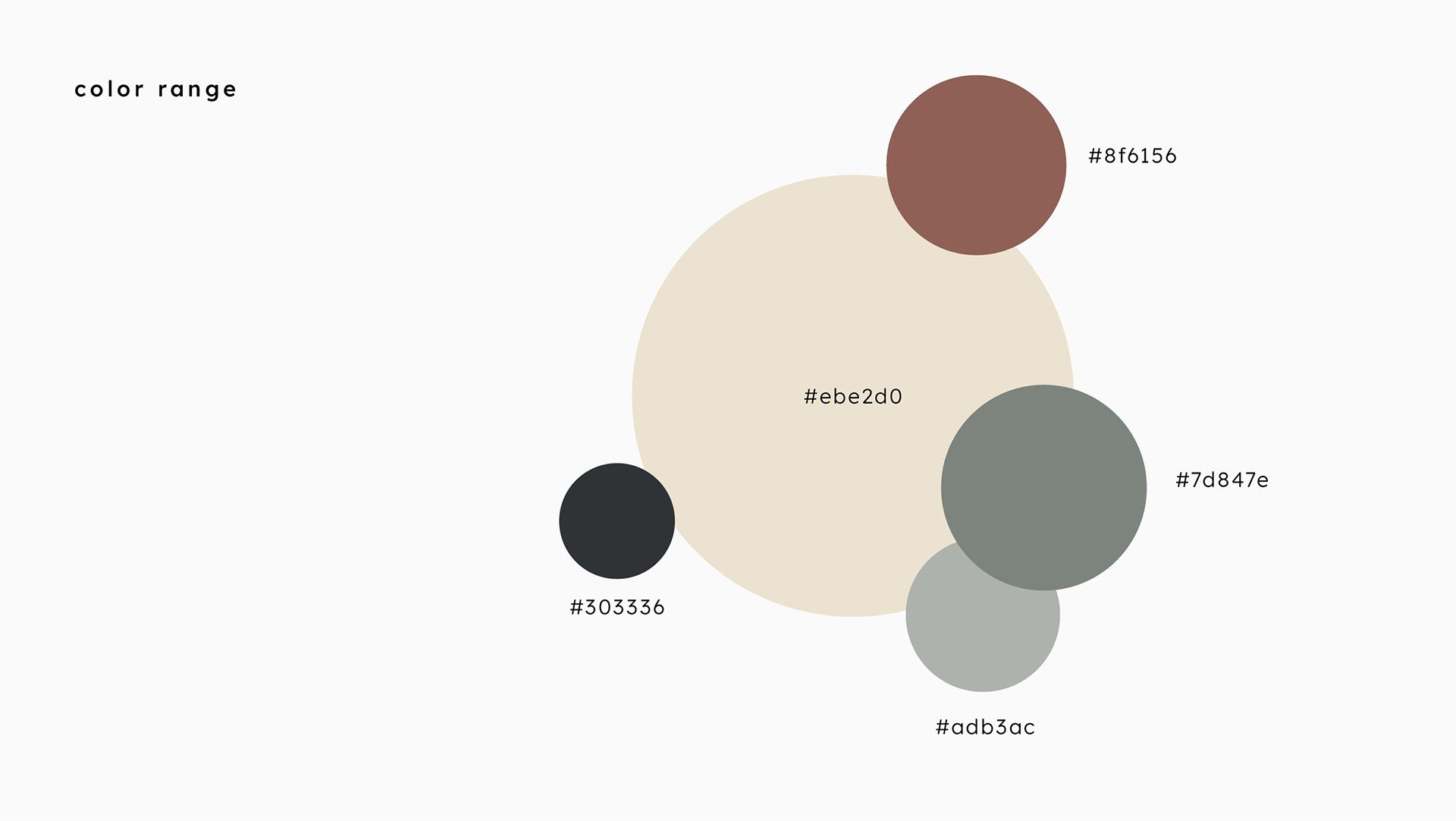
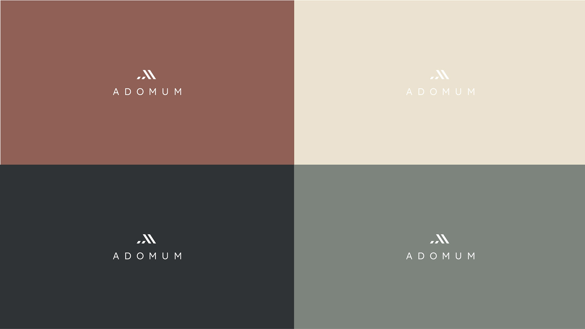
The result is a clear logo with a simple straight-line font and earthy serious colors. Free of unnecessary, without a lot of text and with expressive pictures the website appeals to the ideas of the client. The current project Holzmarkt 66 is shown on the website and invites to action.
See more here www.adomum.de
Many thanks for the great cooperation to
Andreas Hagemann - real estate photographer,
Ovan GmbH for programming the website.
Thanks for watching! ♡
Follow me on Instagram